Interpreting spatial flow data; Visualization and insight
Jodie England, Nik Lomax and Layik Hama - The University of Leeds
Big data is high volume and high velocity, as new datasets of increasing size are rapidly generated each year. New forms of processing are therefore required for more optimised analytics and better insight discovery. Analytics of big data and visualization methodologies should be seamlessly integrated in order for a streamlined, efficient application of big data processing.
Project aims
Traditional spatial flow data visualization techniques struggle to represent the increased complexity of more recent datasets. This research explores methods of spatial data visualization for better perception of flow, with the application of these methods to big data from the UK in order to propose a workflow of effective spatial flow data visualization in R.
Explaining the science
A Spatial Interaction Model (SIM), provided by Nik Lomax, predicted migration pattern flows within the UK using census population data as an input. The Northern Ireland (NI) region was isolated using the grep function in R, to provide a small dataset for quick proof-of-concept visualization. Entries with flow values less than 100 were deleted.
Visualization with ggplot2
A NI shapefile was obtained from the ONS and converted into a Data Frame, which was then merged with the SIM data in order to obtain XY values for each data point. The maps and ggplot2 packages were used to visualize the data, with transparency indicating the amount of flow (Figure 1).
This visualization method lacks key metadata such as area names and indication of specific flow values – so whilst simple and easy to generate, this plot lacks key information for the effective perception of flow.
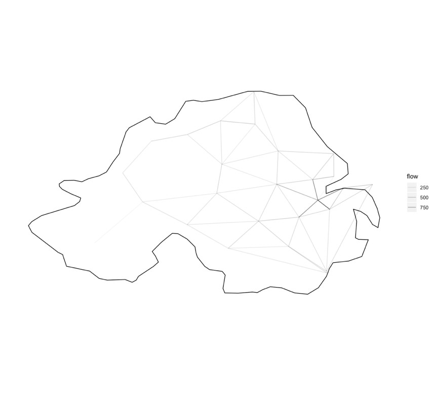
Figure 1. Visualisation of Northern Ireland flow data using ggplot2.
Visualization with Mapdeck
Mapdeck is an R package that allows the visualization of flow data on an interactive map, utilising the Mapbox GL and Deck.gl online resources (Cooley, 2018). The interactive output provides flow value information when hovered over the line. Line data was prepared by ordering the data frame in descending order. The colorRampPalette function then assigned the highest flows with the colour blue, and the lowest flows with the colour orange. The Mapdeck function was then used to generate the visualization (Figure 2).
Whilst Mapdeck visualization solves the issue of missing metadata presented in ggplot2 visualization, this method also does not specify the origin and destination of each flow value, so the direction of the flow cannot be ascertained.
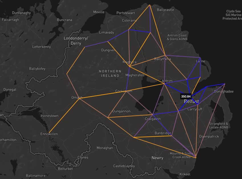
Figure 2. Visualisation of Northern Ireland flow data using Mapdeck.
Circos Plots
Circos plots are a method of visualizing data in a circular layout, originally designed for comparative genomics. Chord diagrams, a type of circos plot, are ideal for exploring relationships between objects or positions, and as such, they can be easily translated into spatial flow data contexts. The compactness of circular visualization allows data to be layered in a coherent manner, making it ideal for the collation of multiple datasets. Chord diagrams are also highly customisable, making this visualization method appealing for both researchers and wider audiences such as the media or business contexts. I, therefore, chose to explore chord diagrams for further use in my project.
Visualization with Circlize
Using the SIM data frame generated previously, the Circlize R function was used to produce a chord diagram output of flows (Figure 3). The plot indicates that the highest amount of flows lie between Castlereagh and Belfast, since they are very close geographically. Whilst Circlize produces a visually appealing output, the plot lacks annotation with data values, so specific flow information cannot be cited.
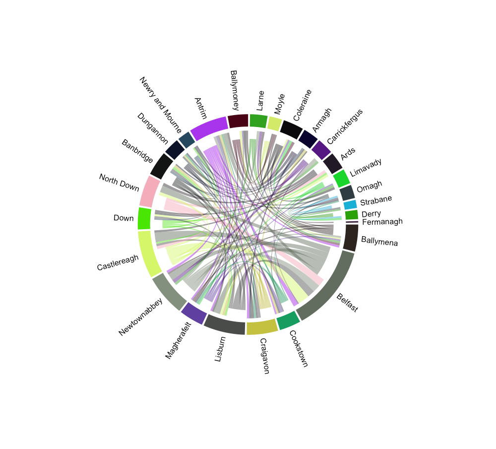
Figure 3. Visualization of Northern Ireland flow data using Circlize. Arcs depicted closer to the outer circle are moving out of the area, and arcs depicted closer to the centre of the circle are moving into the area.
Visualization with ChordDiag
The ChordDiag package utilises the JavaScript visualization library D3 to create interactive chord diagrams (Flor, 2017). The Northern Ireland flow data frame was converted into a square matrix using the R acast function, to generate an array. Instead of deleting flows less than 100, values were instead replaced with ‘N/A’ identifiers in order to retain the square matrix. The ChordDiag function was then used to generate the interactive chord diagram (Figure 4).
This plot solves the key issues identified with Circlize visualization. If you hover over an area, such as Lisburn in Figure 4B, the isolated flow arcs for that area are emphasized as well as the value of total flows within that area. If you then hover over a specific arc, such as the Lisburn-Belfast arc in Figure 4C, you are able to identify the specific flow values both to and from the area. This means you are able to identify large flows that may not have been evident when visualizing with Circlize, such as this large flow between Lisburn and Belfast. The html output can be easily embedded onto a website, github page or other web-based location, and static screenshots can be taken for use in print-based media.
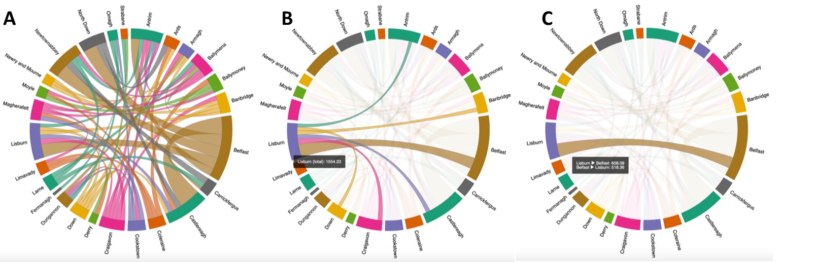
Figure 4. Visualization of Northern Ireland flow data using ChordDiag.
A: Total flows displayed on the chord diagram.
B: Total flows specific to Lisburn, displayed when the mouse hovered over the Lisburn identifier of the outer circle.
C: Flows between Lisburn and Belfast, displayed when the mouse hovered over the arc between Lisburn and Belfast.
Results
Chord diagrams are a promising method of visualising spatial data. However, issues may arise when presenting results to an audience unfamiliar with how chord plots work – as it does not provide the same geographical context as mapping the flows on a traditional map. Therefore, I propose the use of chord diagram visualization in tandem with traditional mapping techniques, such as Mapdeck visualization, so that the geographical context of the spatial data and general trends can be identified, whilst also providing the opportunity for more detailed data analysis from the specific flow information provided by the chord diagram.
Applications
Improving the visualisation methods of spatial data allows researchers to draw conclusions from such data with more clarity and confidence. Being able to identify large flows that may have otherwise been missed is important in the field of urban analytics, allowing researchers to identify potential areas of interest and further research.