
When Deprivation Doesn’t Tell the Whole Story: Comparing Measures of Need and Evaluating Food Policy Equality
In partnership with IGD (Institute of Grocery Distribution)
Change the measure, and you can change the conclusions we draw. This is a challenge when trying to identify people in need of support. The metrics we use to define ‘need’ can shape both who is identified as a priority for receiving support and how we judge whether national policies have an equitable impact.
Across England, living conditions vary widely from one area to the next. National measures of deprivation, particularly the Index of Multiple Deprivation (IMD) are routinely used to rank and compare places and allocate funding and support. The IMD ranks more than 33,000 small neighbourhoods across England, creating a national picture of relative disadvantage. This shows that deprivation is not confined to a small number of places, in fact, around 65% of local authorities contain at least one neighbourhood among the most deprived in England. As a result, national rankings can be extremely useful, offering a consistent national picture and identifying areas of disadvantage (MHCLG, 2025). They influence real-world decisions, from local authority resource allocation to how national policies are shaped. But deprivation is multidimensional, and no single measure can capture all aspects of “need”. Different measures might incorporate different indicators or weightings, and these choices can change which communities appear most vulnerable. As a result, these differences are hidden in plain sight, masked by the metrics used and the simplicity of the labels applied.
Food access is a clear example of this. Two neighbourhoods might look broadly similar in terms of general deprivation yet face completely different realities when it comes to the affordability or accessibility of food. For example, some rural areas sit far from the nearest source of healthy food, meaning that challenges in obtaining healthy, affordable food do not consistently occur in the most deprived areas. When decisions rely solely on broad, more general measures, areas with difficulties accessing food risk being overlooked.
Two measures illustrate these differences. The Index of Multiple Deprivation (IMD) is the official government measure of neighbourhood deprivation in England (MHCLG, 2025). The Priority Places for Food Index (PPFI) was developed to identify areas requiring additional support with food access (Pontin et al., 2023). Both indices capture vulnerability, but they reflect different conceptualisations of what ‘priority’ means and may therefore identify different communities as being in need. Despite their policy relevance, there has been limited systematic comparison of how IMD and PPFI align or diverge, and what these differences imply for intervention targeting, such as allocating funding to improve healthy food access for children.
The measurement choice is particularly important when evaluating the fairness of national policies. In October 2022, England introduced legislation restricting placement-based promotion of High Fat, Sugar and Salt (HFSS) products in large retail stores. As part of the Diet and Health Inequalities (DIO‑Food) programme, researchers conducted the first independent national evaluation of the impact of the legislation using interrupted time series analysis of supermarket sales data (Jenneson et al., 2024; Kininmonth et al., 2025). Their analysis across PPFI deciles, revealed that the effect was similar across all PPFI deciles, suggesting that impacts of the policy were equally distributed across areas with differing levels of need for support accessing healthy and affordable food. These findings are promising. However, IMD remains the primary deprivation metric used across government, and it is not yet clear whether the same conclusions about the fairness of the policy would hold if deprivation were measured using IMD instead. Evaluation of the fairness of the policy using IMD is important so that comparisons can be made with other evidence that predominantly uses IMD.
This project addresses these gaps in two key phases:
- Phase 1: Develop an interactive geospatial dashboard enabling comparison of IMD and PPFI across England, revealing where the two measures align and where they diverge in identifying areas with greater need for support.
- Phase 2: Undertake interrupted time series analysis to examine whether the impacts of the legislation were equitable across IMD deciles, with direct comparison to existing DIO-Food findings across PPFI deciles.
Together, this project examines how measurement choice shapes both where it is important to provide additional support and how we evaluate the equitability of national policy.
Data and methods
Phase 1: Developing the IMD-PPFI Interactive Explorer
The primary objective of Phase 1 was to design and deploy an interactive tool enabling transparent and accessible comparison of two indices of need across England.
Data Sources
This phase used two publicly available datasets:
- IMD (MHCLG, 2025)
- PPFI (Pontin et al., 2024)
Data Preparation
To support meaningful comparison at a policy-relevant geographic scale, IMD and PPFI datasets were processed and aligned at two spatial scales: Lower Super Output Area (LSOA, neighbourhood level) and Local Authority District (LAD, strategic policy level). IMD is already available at these two scales. However, PPFI was only available at LSOA scale.
To ensure a meaningful comparison at a LAD policy-relevant scale, the existing PPFI methodology and codebase were adapted to construct LAD-level estimates using population-weighted aggregation of LSOA scores. LSOAs were spatially linked to their corresponding LADs, and weighted summaries were calculated to reflect the distribution of food support priority within each district rather than relying on simple averages. This approach ensured methodological consistency with the original PPFI logic while producing a dataset that’s geographically comparable to IMD at the LAD level. Detailed description of the methodology and datasets used can be found in the GitHub repository.
Following this, harmonised datasets were constructed at both LSOA and LAD level, with standardised geographic identifiers, aligned decile rankings, and derived indicators created to capture alignment and divergence between the two indices.
Dashboard Architecture and Functionality
The dashboard was developed using a Python-based web framework (Plotly Dash) to create a browser-based, interactive application. The system architecture separated:
- Data processing (pre-processed GeoJSON layers and harmonised datasets)
- Layout design (map panels, controls, information panels)
- Reactive callback functions (dynamic filtering and updates)
Choropleth maps were generated using geospatial boundary files and rendered side-by-side to enable direct visual comparison between IMD and PPFI. User inputs (such as vulnerability thresholds (e.g., top 20% or 40% highest-priority areas) and geographic level selection trigger callback functions that update the maps and summary statistics in real time.
Key functionalities include the ability to:
- View side by side choropleth maps of IMD and PPFI
- Apply adjustable vulnerability thresholds (e.g., top 20% or 40% highest-priority areas)
- Identify neighbourhoods where indices align or diverge
- Drill down from LAD to LSOA level
- Explore mismatch patterns through dynamic filtering
- Explore how the different ‘domains’ that make up IMD and PPFI contribute to any mismatches
This reactive design was chosen to prioritise transparency and usability. Rather than presenting a fixed interpretation, the tool allows users to test how spatial targeting changes when different thresholds or domains are applied. The codebase was structured modularly to ensure reproducibility and future scalability. The repository is publicly available for further information - visit the Github site, supporting open research practice. The dashboard is currently undergoing live deployment on the Healthy and Sustainable Places Data Service website.
Phase 2: Interrupted time series evaluation of HFSS legislation
Data Sources
- IMD (MHCLG, 2019)
- Daily, store-level in-store sales data from three major UK retailers
- Product level nutrition data
Statistical analysis
This phase extends earlier work from the Diet and Health Inequalities (DIO-Food) programme. The DIO-Food team conducted the first independent national evaluation of England’s 2022 High in Fat, Sugar and Salt (HFSS) product placement legislation. Using daily supermarket sales data from four major retailers, they examined whether the HFSS legislation had an impact on sales of less healthy products following its introduction, and whether impacts were equitable across areas with different levels of need, measured using the Priority Places for Food Index (PPFI). This phase extends that evaluation by applying the same analytical approach using IMD as the measure of need instead.
The analysis used daily, store-level in-store sales data from three major UK supermarket retailers covering:
- Up-to 18-months before the legislation (1st April 2021 – 30 September 2022)
- 12-months after implementation (1st October 2022 – 30 September 2023)
Stores were linked to the IMD (2019) based on their neighbourhood location. This allowed us to examine whether changes in HFSS sales differed between more and less deprived areas.
The statistical approach mirrored the DIO-Food evaluation. To assess whether the impacts of the legislation on sales of less healthy products were equitable, subgroup ITS analyses were conducted across IMD deciles for stores in England. The segmented regression models included terms for time, step change (i.e. rapid effect due to the intervention), slope change (i.e. change in the trend following the intervention), daily and seasonal autoregressive and moving average terms and dummy indicators for days of the week and fortnights of the year, and holiday days. Results were estimated separately for each retailer and then combined to provide an overall picture. By holding the analytical method constant and changing only the deprivation measure, this phase isolates a key question: does our conclusion about whether the policy was equitable depend on how we define deprivation?
Key findings
Phase 1 showed that IMD and PPFI do not always identify the same areas as priorities for support. When applying a common threshold (for example, the top 20% most vulnerable areas), clear divergences emerged at both neighbourhood (LSOA) and Local Authority District (LAD) level. At the LSOA level, only 3,516 areas appeared in the top 20% on both indices. The remaining high-priority areas were split evenly: 3,235 LSOAs were highlighted only by PPFI, and 3,235 were highlighted only by IMD. This means that out of 6,751 LSOAs identified as most in need by each measure, almost half differed depending on which index was used. A similar pattern appeared at the LAD level: of 59 Local Authorities in the top 20%, just 23 appeared on both lists, while 36 were identified only by PPFI and 36 only by IMD. Some neighbourhoods therefore ranked high-priority in needing support with accessing healthy affordable food but were not among the most deprived overall. In contrast, some of the most deprived areas did not rank as highly when food access and affordability were considered specifically.
This divergence is not random. It reflects the different dimensions captured by each index: IMD summarises broad structural disadvantage across multiple domains, while PPFI focuses specifically on barriers to accessing affordable healthy food. As a result, relying on a single measure can change which communities are prioritised for intervention.
Image 1: National comparison map showing IMD vs PPFI top 20% priority Local Authority Districts
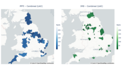
Maps showing the top 20% most vulnerable Local Authority Districts under IMD and PPFI. Highlighted regions show mismatches where food-related vulnerability does not fully align with overall deprivation.
Accessible description: This figure consists of two choropleth maps of England displayed side by side at Local Authority District level. The left panel shows Priority Places for Food Index (PPFI) results and the right panel shows Index of Multiple Deprivation (IMD) results. In both maps, only the top 20% highest-priority districts are highlighted. The left map uses a blue colour scale and is titled “PPFI - Combined (LAD)”. The right map uses a green colour scale and is titled “IMD - Combined (LAD)”. Each map includes a vertical legend labelled “Rank”. Darker shades indicate districts ranked closer to the highest-priority end of the distribution. Areas not in the top 20% are not highlighted. On the PPFI map, highlighted districts are more widely distributed across England, including rural, coastal, and northern areas. On the IMD map, highlighted districts are more concentrated in urban and post-industrial areas, with clusters visible in parts of northern England and other metropolitan areas.
Image 2: Differences in the underlying drivers of need highlighted by PPFI and IMD, using Rothbury (LSOA), Northumberland as an example.
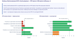
Bar charts comparing the domains that contribute most to PPFI and IMD scores within the Rothbury (LSOA), Northumberland. PPFI highlights food‑access challenges such as poor supermarket proximity and limited online delivery options, while IMD shows relatively low deprivation across most domains. This contrast explains why Rothbury is flagged as higher priority on PPFI than IMD.
Accessible description: This figure presents a case-study comparison for Rothbury (Northumberland 007C), a Lower Super Output Area in Northumberland. It combines a summary text box and two horizontal bar charts to compare the area’s ranking under PPFI and IMD. At the top of the figure is a title stating that Rothbury has PPFI decile 2, IMD decile 8, and a difference of minus 6. Beneath this is a shaded explanatory box summarising the mismatch between the two indices. Below the summary are two side-by-side horizontal bar charts. The left chart is titled “PPFI domains (decile; 1 = highest priority)” and the right chart is titled “IMD domains (decile; 1 = most deprived)”. Both charts use a horizontal decile scale from 0 to 10. A dashed vertical line marks the composite decile for the index shown in that panel. In the PPFI chart, the bars are coloured red and green. Lower decile values, indicating higher priority, appear closer to 1. In the IMD chart, most bars are green, with some orange bars for domains with lower decile values. The dashed line marks the PPFI composite decile at 2. Several food-access-related domains sit at or near decile 1 to 2, including proximity to supermarket retail facilities, accessibility to supermarket retail facilities, access to online deliveries, and proximity to non-supermarket food provision. Other domains, including socio-demographic characteristics, need for family food support, and fuel poverty, are at higher deciles, indicating lower priority relative to the access-related domains. The dashed line marks the IMD composite decile at 8. Most IMD domains, including income, employment, education, health, and crime, lie at relatively high deciles, indicating lower deprivation. The main exceptions are barriers to housing and services and living environment, which are at lower deciles than the other IMD domains.
The interactive dashboard makes these differences visible and easy to explore for a range of users, from national policymakers to local authority analysts and community organisations. It brings national datasets together into one accessible tool, allowing users to see how priority areas shift under different definitions of vulnerability, without requiring specialist data processing skills. This supports more transparent and evidence-based targeting decisions.
Video Demo - Walkthrough of the tool
Watch this screen recording demonstration of the dashboard illustrating how priority areas shift when different deprivation measures or thresholds are applied, and how the dashboard works.
Accessible description: The video begins with a comparison view showing two side-by-side maps of England. The left map represents PPFI using a blue colour scale, while the right map represents IMD using a green colour scale. In both maps, darker shades indicate higher priority or greater deprivation. This initial view highlights that the spatial patterns identified by the two indices differ. The user clicks on Leeds to explore how a specific area is classified under each index. The interface updates to reflect this selection. They then switch to the Local Authority District level and apply filters to show the top 20% most vulnerable areas, followed by the top 80%. As these thresholds change, the highlighted areas on the maps expand, illustrating how the definition of “priority” varies depending on the threshold used. Next, the user changes the domains being displayed. For PPFI, they select a food-access-related domain, supermarket proximity, while for IMD they select income. The maps update accordingly, demonstrating how the underlying drivers of need differ between the two indices. The video then moves to a differences table explorer, which displays how rankings vary between PPFI and IMD across areas. The user clicks on three different Local Authority Districts to filter the table, and the displayed data updates each time. They then select a specific area, Amber Valley 006D, to view more detailed information, and download the data as a CSV file. Finally, the user switches to a single-index view and then to an absolute difference map, which shows the magnitude of difference between PPFI and IMD rankings across areas using a colour scale. The user adjusts a threshold filter to a value of 2, updating the map to highlight only areas where the difference between the two indices is at least two deciles.
Phase 2 extended the DIO-Food evaluation framework by applying IMD instead of PPFI as the deprivation measure. This analysis provides a direct methodological comparison: it examines the equitability of the HFSS legislation using a standardised national metric of deprivation and tests whether conclusions about the equality of HFSS legislation remain consistent when measured using the Government’s primary deprivation metric. By replicating the DIO-Food evaluation using IMD, the project strengthens confidence in equality conclusions and clarifies how measurement choice influences interpretation. Detailed results are currently pending retailer and partner approval.
Together, these findings demonstrate that the way we define ‘need’ can shape both where support is directed and how policy success is interpreted.
Value of the research
This research has practical implications for stakeholders using measures of need to make decisions about where to direct support, from local authorities allocating resources, to national policymakers designing policy, to retailers and charities identifying priority areas. This work enhances evidence‑informed decision‑making by clarifying how different deprivation measures shape our understanding of area-level need and policy impact. By systematically comparing IMD and PPFI, the project highlights where food‑related challenges may be obscured within broader deprivation rankings, supporting more accurate targeting of national and local interventions.
The IMD-PPFI interactive dashboard provides practical value by translating complex geospatial analysis into a clear, accessible tool for exploring how these indices of need identify different places and the reasons why these areas are identified as higher or lower priority for need. Previously, comparing these indices required specialist data skills and manual processing. The dashboard makes that comparison accessible, transparent and reproducible for policymakers, local authorities, and community organisations and supports more informed decision making without specialist data skills.
For national policy, extending the DIO‑Food evaluation to include IMD provides more robust insight into whether the impacts of the HFSS legislation were equitable, and whether the results previously observed using PPFI hold when a different measure of deprivation (IMD) is applied. If findings are consistent across IMD and PPFI, this strengthens confidence in the equitability of the policy. If differences emerge, this highlights the importance of considering how need is defined when assessing the fairness of national policy. These insights are particularly important given the central role of IMD in government reporting and funding decisions. Together, the approach used in this project of comparing measures of need to examine whether policy conclusions about equitability are robust has relevance beyond this national food policy and this work highlights the importance of more nuanced, context‑sensitive approaches to understanding need.
Quote from project partner
“To improve public health, we have to understand the real-world barriers that stop people from accessing healthy, affordable food. The IMD-PPFI Explorer is a game-changer because it takes complex data and turns it into a practical tool for the food industry and policymakers. By building this robust evidence base, we can target support more effectively and drive the large-scale shift toward healthy and sustainable diets that we all want to see.
This research provides the vital evidence and insight we need to ensure that major policies, like the HFSS legislation, are working fairly for every community.”
Hannah Skeggs, Senior Health and Sustainable Diets Manager, IGD
Insights
- IMD and PPFI capture different dimensions of vulnerability, and as a result do not consistently identify the same communities as priorities. The choice of measure can change which area is identified as needing greater support.
- Food-related vulnerability does not always align with overall deprivation rankings. Areas facing the greatest challenges in accessing affordable, healthy food are not necessarily those ranked as most deprived by general measures, highlighting the importance of using a measure appropriate to the context and the question being asked.
- The interactive dashboard makes these differences accessible to a wide range of users without requiring specialist data skills, supporting more transparent evidence-based decision making and reducing reliance on static reports.
- Replicating the DIO-Food evaluation with IMD strengthens confidence in equality assessments and provides a strong contribution to national policy evaluation.
- The framework can be applied to other place-based public health policies.
Team
- Data scientist: Molly Sargent - Data Scientist on the Data Scientist Development Programme at Leeds Institute for Data Analytics, University of Leeds
- Lead supervisor: Dr. Alice Kininmonth - Research Fellow in Nutrition and Lifestyle Analytics, School of Food Science and Nutrition, University of Leeds
- Co-supervisors: Dr. Emma Wilkins - Research Fellow in Nutrition and Lifestyle Analytics, School of Food Science and Nutrition, University of Leeds
- Dr. Victoria Jenneson - Research Fellow in Nutrition and Lifestyle Analytics, School of Food Science and Nutrition, University of Leeds
- Prof. Michelle Morris - Professor of Data Science for Food, School of Food Science and Nutrition, University of Leeds
- Prof. Alexandra Johnstone - The Rowett Institute, University of Aberdeen
Partners
External partner: IGD (Institute of Grocery Distribution)
Funder
Funded by IGD (the Institute for Grocery Distribution) through their Social Impact programmes on healthy and sustainable diets.
This work has been facilitated by the Leeds Institute for Data Analytics (LIDA) Data Scientist Development Programme, which employs early-career data scientists to deliver real-world data-driven impact in the interests of the public good.
References
- Jenneson, V., Pontin, F., Ennis, E., Fildes, A. and Morris, M. 2024. Has HFSS legislation led to healthier food and beverage sales? The DIO-Food protocol – using supermarket sales data for policy evaluation. International Journal of Population Data Science. [Online]. 9(4). [Accessed 9 March 2026]. Available from: https://doi.org/10.23889/ijpds.v9i4.2426
- Kininmonth, A.R., Stone, R.A., Jenneson, V., Ennis, E., Naisbitt, R., Johnstone, A.M., Morris, M.A. and Fildes, A. 2026. [Pre-print]. “It was a force for good but…”: a mixed-methods evaluation of the implementation of the High in Fat, Sugar and Salt (HFSS) legislation in England. OSF Preprints. [Online]. [Accessed 9 March 2026]. Available from: https://doi.org/10.31219/osf.io/3xjtv
- Ministry of Housing, Communities and Local Government (MHCLG). 2019. English indices of deprivation 2019. [Online]. [Accessed 9 March 2026]. Available from: https://www.gov.uk/government/statistics/english-indices-of-deprivation-2019
- Ministry of Housing, Communities and Local Government (MHCLG). 2025. English indices of deprivation 2025: statistical release. [Online]. [Accessed 9 March 2026]. Available from: https://www.gov.uk/government/statistics/english-indices-of-deprivation-2025/english-indices-of-deprivation-2025-statistical-release
- Pontin, F., Baudains, P., Ennis, E. and Morris, M. 2023. “Identifying drivers of food insecurity through linked data- the Priority Places for Food Index”. International Journal of Population Data Science. [Online]. 8(3). [Accessed 9 March 226]. Available from: https://doi.org/10.23889/ijpds.v8i3.2277
- Pontin, F., Oldroyd, R., Baudains, P., Ennis, E., Newing, A. & Morris, M. 2024. ‘Priority Places for Food Index’. (Version 2.1). Data asset provided by the Healthy & Sustainable Places Data Service (ES/Z504336/1), originally produced by the CDRC (ES/L011840/1;ES/L011891/1). [Online]. [Accessed 9 March 2026]. Available from: https://doi.org/10.82147/003
- Pontin, F., Oldroyd, R., Baudains, P., Ennis, E., Murphy Quinlan, M., & Morris, M. 2025. ‘Priority Places for Food Index (Version 2.1) User Guide’. Data asset provided by the Healthy & Sustainable Places Data Service (ES/Z504336/1), originally produced by the CDRC (ES/L011840/1;ES/L011891/1). [Online]. [Accessed 9 March 2026]. Available from: https://leeds-hasp.github.io/data-docs/Priority%20Places%20for%20Food%20Index%20V2.1/2_PPFI_user_guide.html
- Sargent, M., Wilkins, E., Jenneson, V., Johnstone, A., Morris, M. and Kininmonth, A. 2026. IMD-PPFI Explorer (Version 1.0.0) [Computer software]. [Online]. [Accessed 9 March 2026]. Available from: https://github.com/mol-sarg/imd_ppfi_dash_app